Matthew Kee / Work / Brand Identity
Locus Amoenus
An identity for an urban design practice that makes open space feel inviting.
See it in the 3D portfolio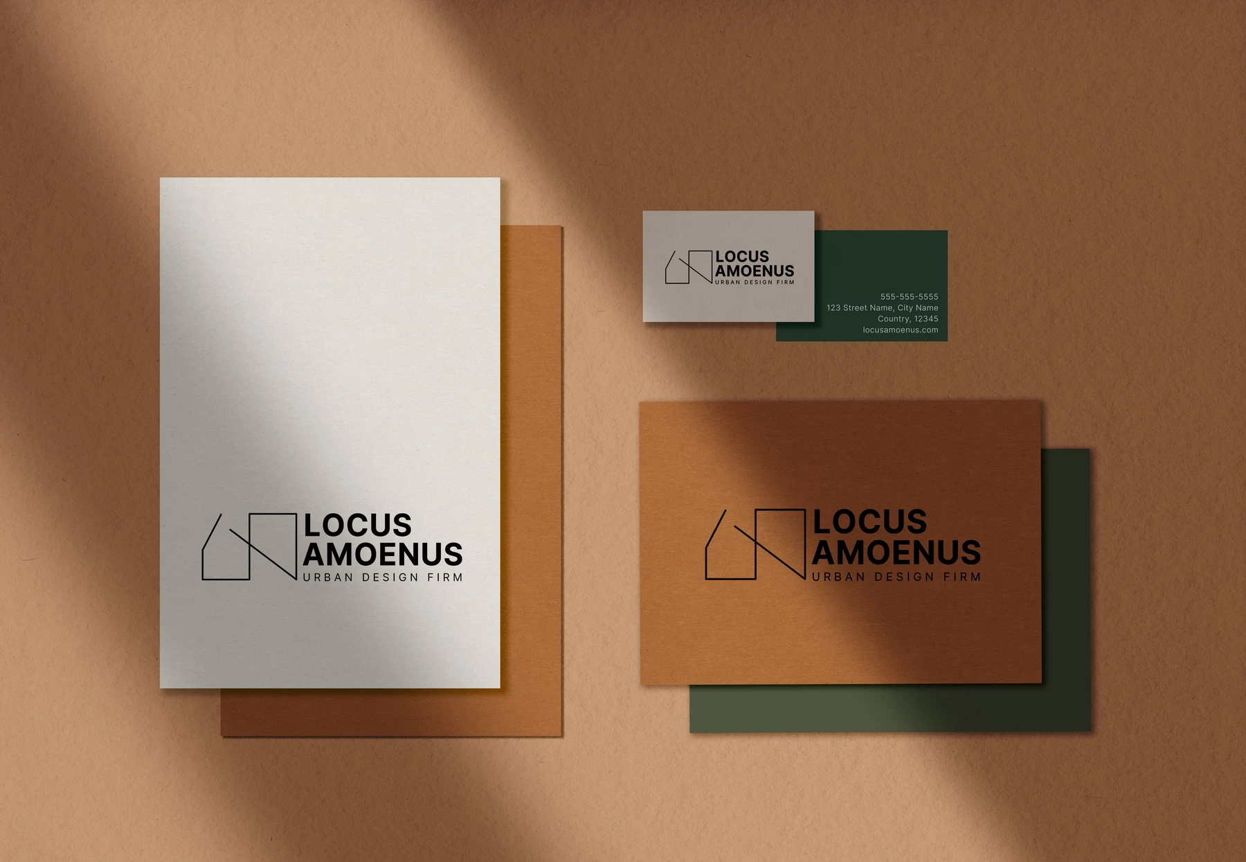
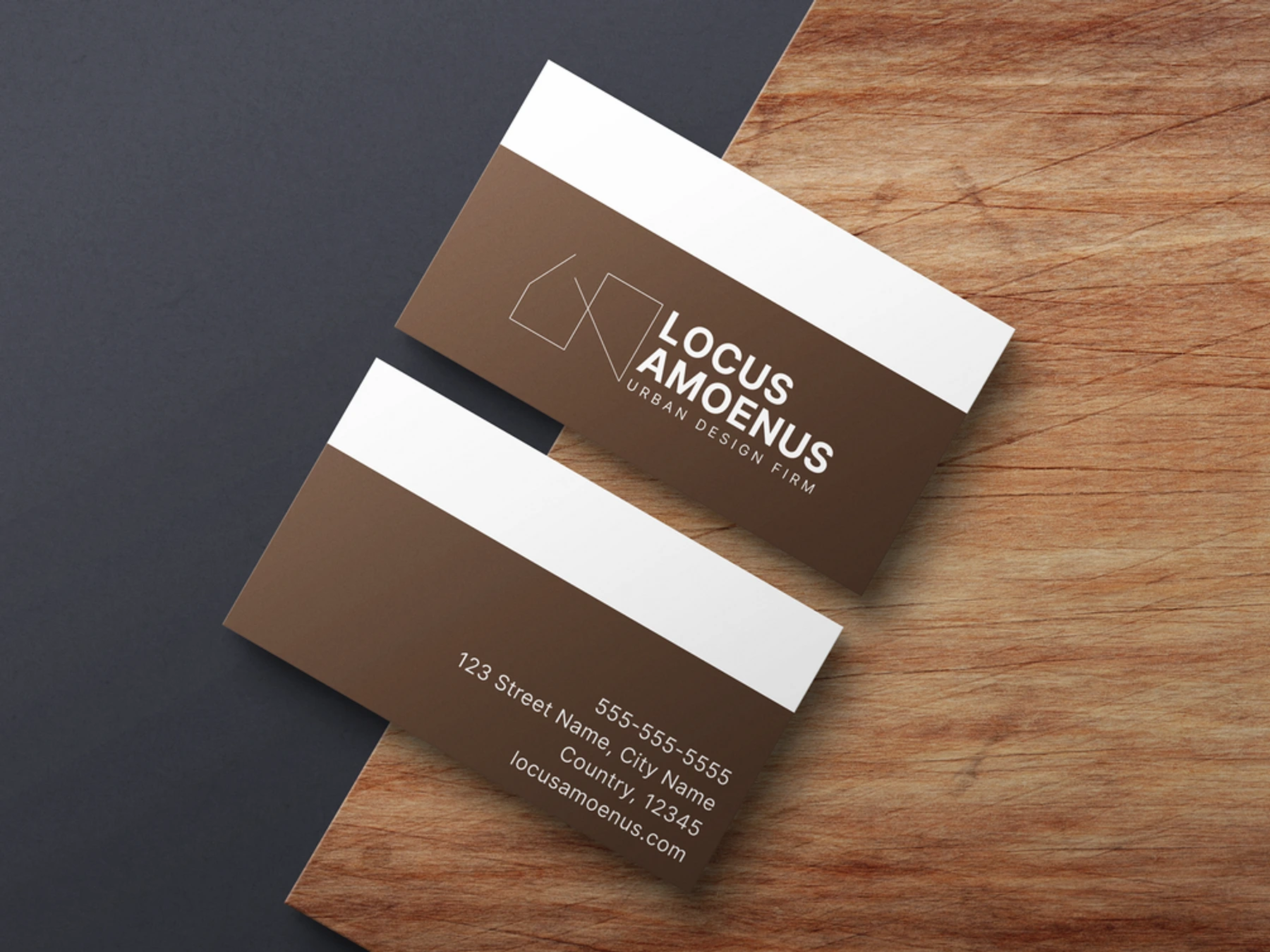
A bold, minimal identity for Locus Amoenus, an urban design and planning studio.
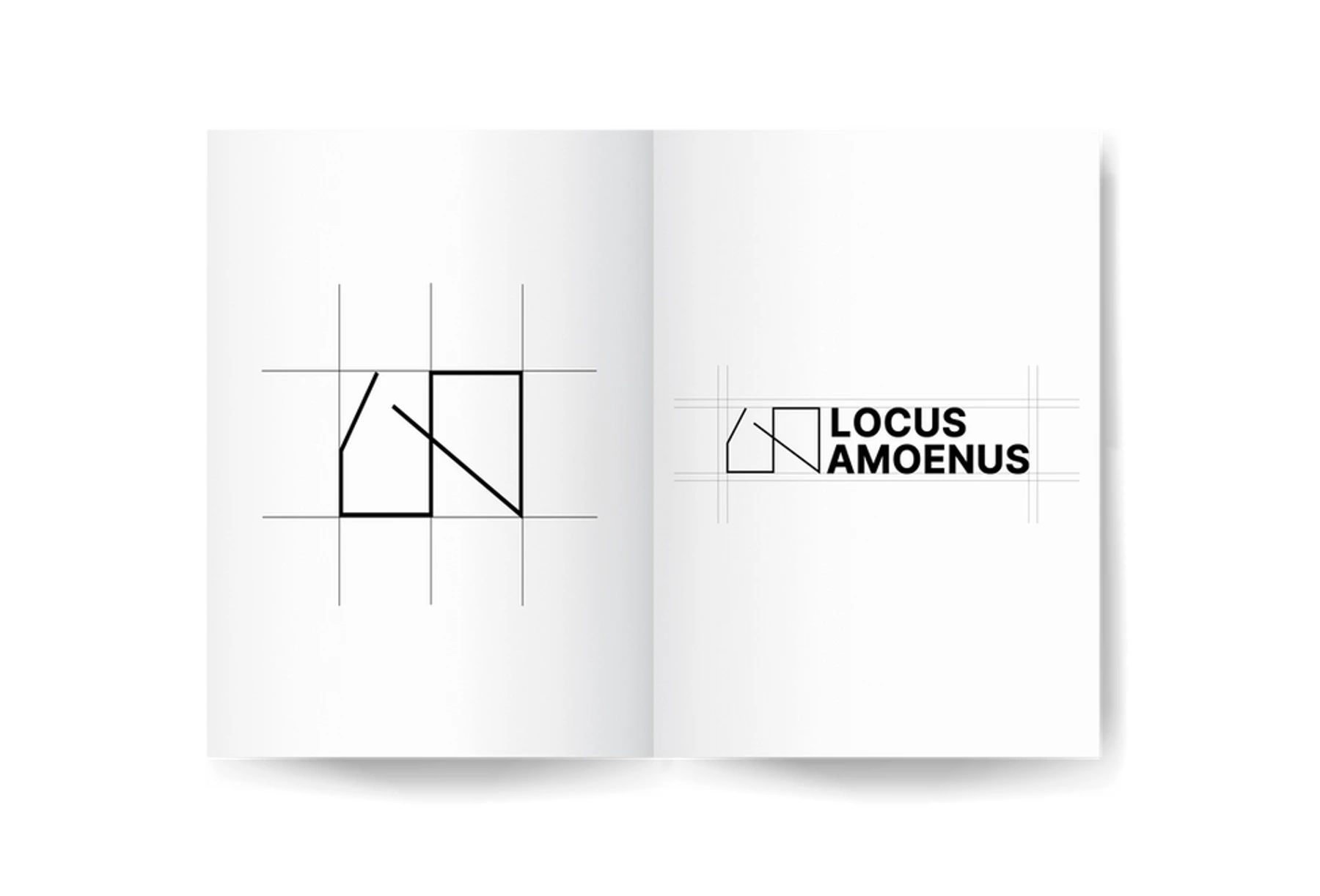
The mark fuses L and A into a single symbol that carries the name and hints at the work: open, welcoming space, built on long-term trust.
- Brief
- A bold, minimal identity for an urban design and planning studio.
- Process
- I fused the L and the A into a single symbol that carries the name and hints at open, welcoming space.
- Outcome
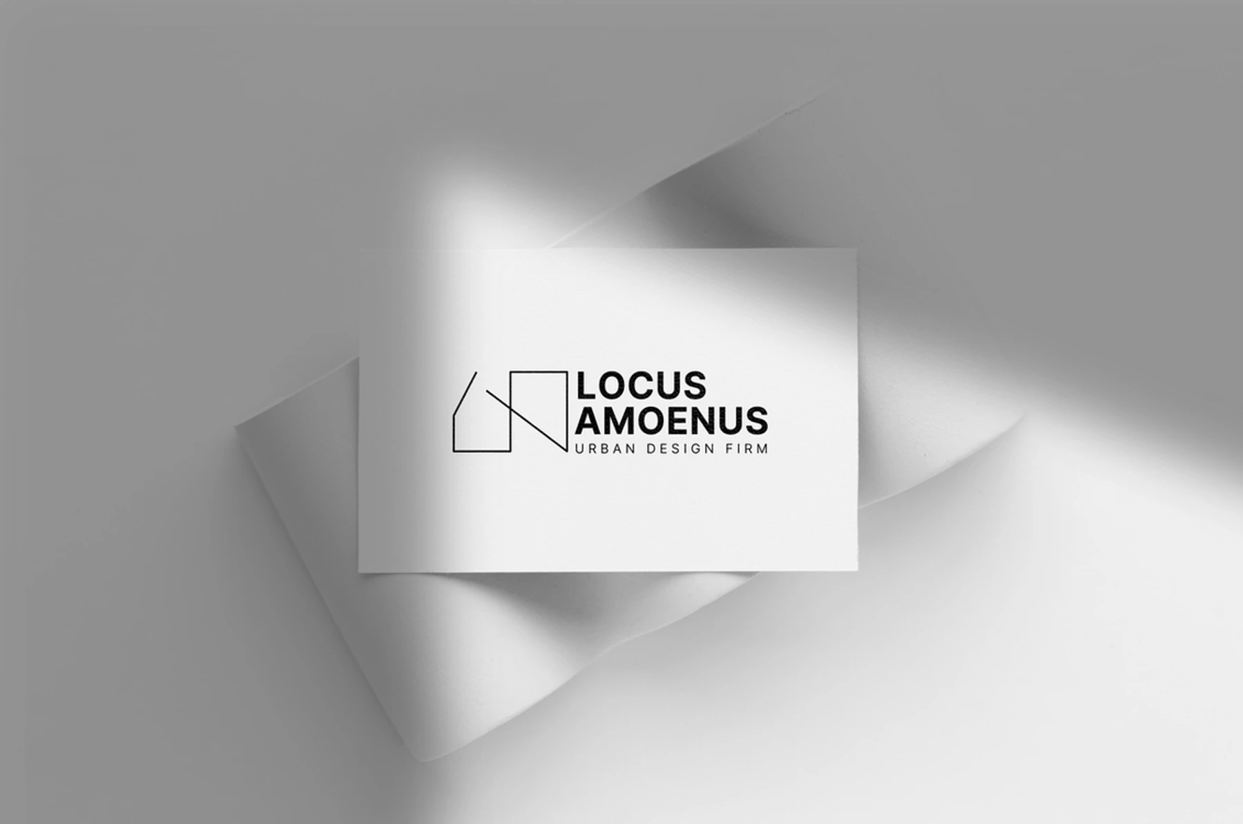
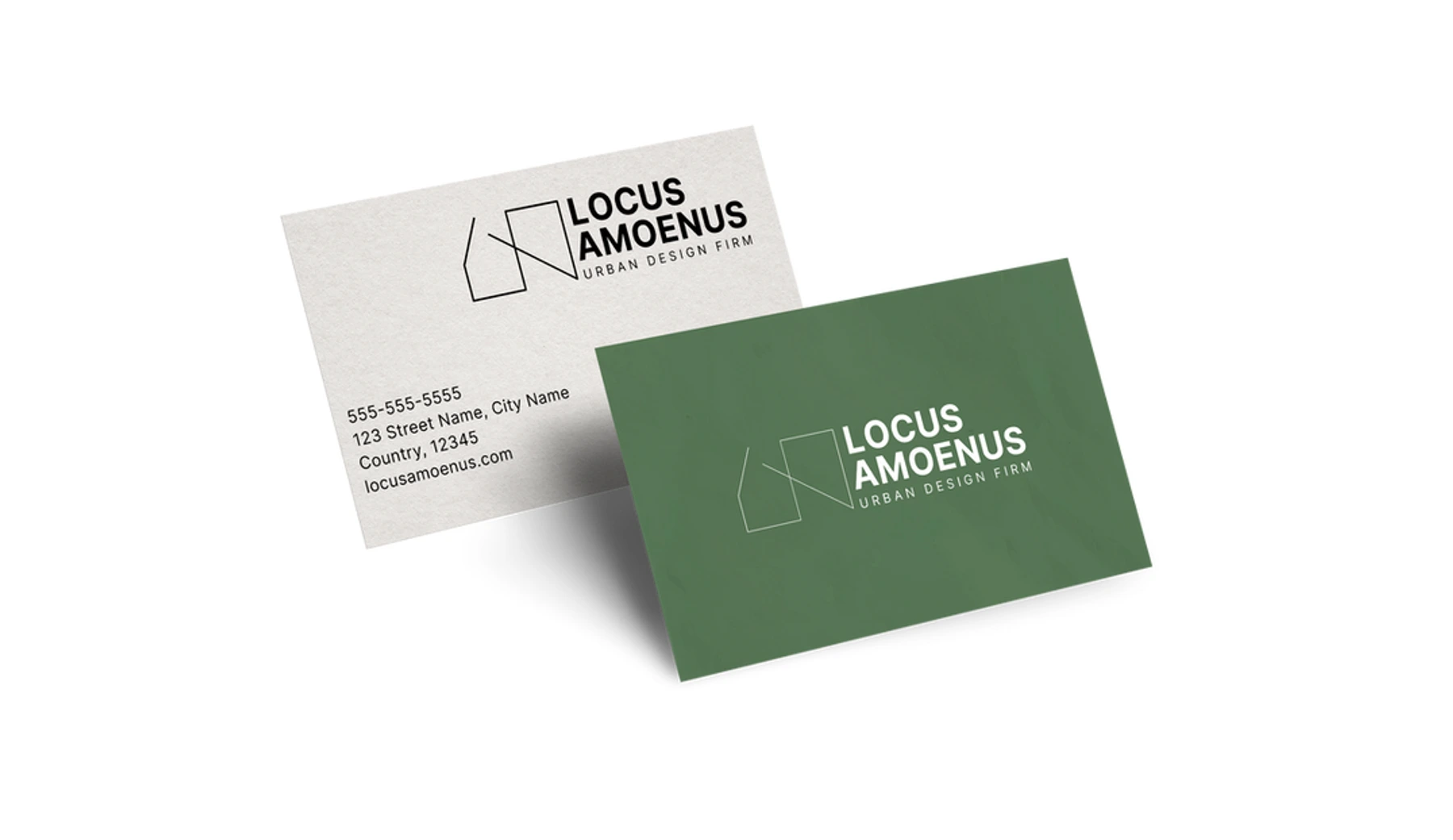
- A mark and wordmark applied across stationery and print.
- Disciplines
- Brand Identity, Logo Design, Stationery Design
- Tools
- Illustrator, Photoshop
Next: Amelia Fitness · Get in touch